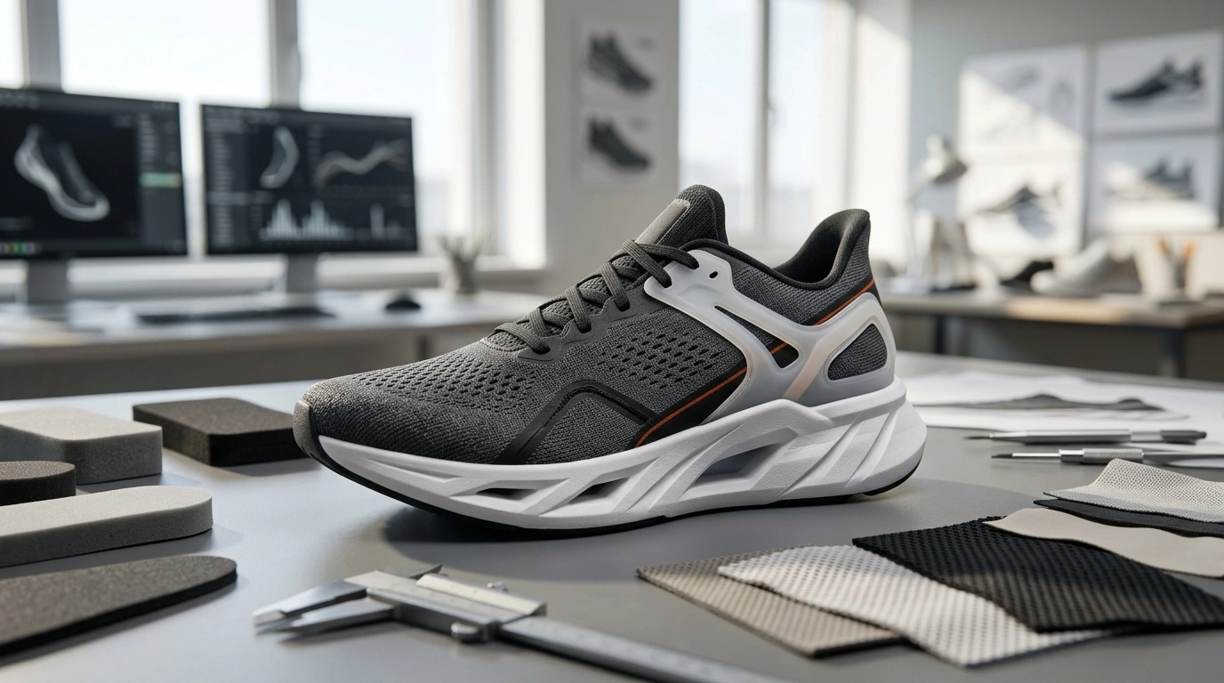
Adidas has built a system where product innovation and brand image reinforce each other: performance stories become design cues, design language becomes marketing shorthand, and marketing narratives feed back into what “innovation” is expected to look and feel like. For designers, marketers, and brand builders, the key takeaway is that innovation isn’t just a feature list—it’s a recognizable set of signals that customers can spot instantly and explain quickly. For more guidance, see Product innovation by Adidas Group through Sustainability.
A useful working definition is: innovation image = what the audience can recognize in 2 seconds + what they can explain in 20 seconds. The “2 seconds” is silhouette, texture, and visual confidence; the “20 seconds” is a crisp story supported by proof. For further reading, see Adidas.
Innovation reads fastest through repeatable cues—distinctive foam geometries, visible tooling, knit textures, translucent layers, engineered seams, and purposeful cutouts. These elements act like visual shorthand: even before someone reads a spec, they can sense “performance,” “precision,” or “tested.”
Adidas also turns performance validation into a design element. Athlete association, sport context, and lab-style language (“engineered,” “tested,” “built for”) are not afterthoughts; they become part of the visual and verbal system. The result is consistency across touchpoints: product pages, retail displays, short social edits, and packaging all broadcast the same innovation signals instead of telling different stories in different places.
Adidas commonly builds credibility through a layered stack of cues:
| Lever | What the audience sees | What it implies | How to adapt responsibly |
|---|---|---|---|
| Distinctive tooling/geometry | Unusual midsoles, cutouts, layered soles | Engineering and performance intent | Create a signature form tied to measurable benefit |
| Material naming + texture | Unique knit patterns, foam feel, glossy/technical finishes | Proprietary R&D and expertise | Name materials only when substantiated; show texture clearly |
| Athlete or sport anchoring | On-field visuals, training settings, race-day context | Proof under pressure | Use authentic testers and real use-cases, not generic “elite” claims |
| Sustainability progress | Recycled icons, “made with” statements, impact callouts | Modern responsibility and future-facing innovation | Be specific on inputs, scope, and trade-offs; avoid vague claims |
| Collab cultural transfer | Partner logos, capsule storytelling, limited drops | Relevance and desirability | Choose partners with shared values and a clear design rationale |
Adidas-style performance communication often starts with silhouette logic. Performance lines lean toward tension: sleek, aerodynamic profiles, technical paneling, and “pulled” lines that imply control. Lifestyle lines borrow those cues selectively—enough to inherit credibility without pretending to be a race-day tool.
Color strategy typically follows a simple hierarchy: core neutrals (black, white, gray) create technical seriousness, while high-chroma accents deliver energy and motion. The accent color works best when it’s treated as a system—reappearing on lace tips, outsole hits, a heel tab, or a small badge—rather than random decoration.
Typography and labeling should feel engineered: concise claims, minimal but confident specs, and controlled use of icons. Innovation looks more believable when the label set is disciplined: one hero benefit, one supporting spec, and one proof reference (test, athlete context, certification).
For deeper reference material and examples you can operationalize, see How Adidas Shapes Innovation & Image – The Ultimate adidas innovation image Guide for Designers, Marketers & Brand Builders.
Innovation image improves when teams move faster with clearer documentation. If you’re building modern workflows, a compact learning resource like Teach Yourself AI Fast | Beginner-Friendly Ebook for How to Teach Yourself AI Basics Fast can help structure research, testing summaries, and repeatable content modules without bloating the process.
If personalization and recommendation systems are part of your product storytelling (what gets shown, to whom, and why), Rufus Knows You: How Your Past Purchases Teach AI to Recommend Smarter is a practical way to understand how behavioral data can shape what “innovation” looks like at the storefront level.
When analyzing a brand’s innovation claims, rely on primary sources and clear definitions of claims and ownership. Useful references include the adidas Annual Report, the adidas Newsroom, and the WIPO overview of intellectual property and branding basics for guidance on protecting naming, design, and brand assets.
Tie one specific claim to a visible cue and a proof point: a measurable benefit, a real use-case, and consistent visuals across product, retail, and social. The tighter the link between what people see and what you can prove, the more believable the innovation feels.
Focus on one signature improvement, document testing honestly, and build recognition through repetition rather than breadth. A disciplined visual system can outperform a long feature list when it’s consistent and backed by real results.
Use precise language (for example, “made with X% recycled content”), clarify scope, and acknowledge trade-offs when they exist. Avoid vague claims that can’t be verified and prioritize transparency over perfection.




Leave a comment